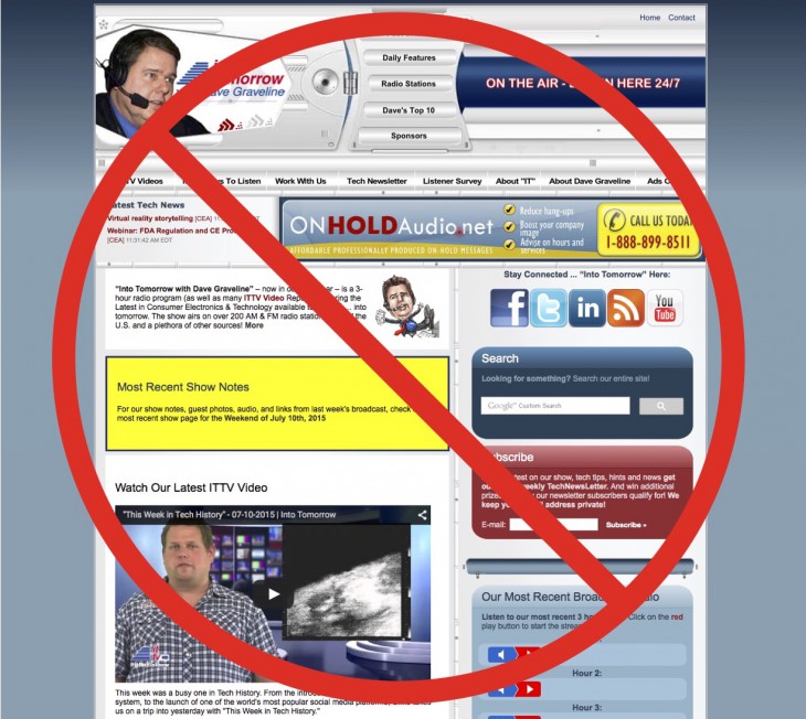
Your opinion please…?
Welcome to the brand new “Into Tomorrow” website. While it’s still a work-in-progress as we continue migrating 20 years worth of shows and content, we wanted to give you a preview of what’s to come.
Please . . . give us your initial opinions by commenting below. Good or bad, your input will really help our Web Team a lot in our efforts to bring you further . . . “Into Tomorrow”, so please don’t be shy. I personally appreciate hearing from you.
Let us know what you like, don’t like, would like to see added or removed … basically what would make YOU  happy when you visit us here at IntoTomorrow.Com What do you think this should look like. Do you have any trouble navigating around? Can you find everything you’re looking for? Does the added, new content
Don’t be surprised if your comments — again pro or con – result in us sending you a prize for your help and input.
Thank you and Stay tuned … “Into Tomorrow”
~ Dave
PS – If you don’t remember what the old website looked like you can check it out below in all its glory!
R.I.P.


We really look for & appreciate your comments here! THX 🙂
Congratulation on this big website. I can tell a missive work has been done to reach this high level of accomplishment. I really like it a lot. However, I have some suggestions.
The two links of the affiliation in the top of the main page need to be organized and rewritten again. For example, “Want to become an Affiliate Radio Station? Click here.” I would think this is too many words to be in the top and needs to be shorter as two or three word, e.g. “ Click to become an affiliate” something like that.
AFFILIATES LINK “ Learn about being an affiliate” takes to you to the same page like when you click on ““Want to become an Affiliate Radio Station? Click link”. Repeated windows and links? Maybe. The website can be easily hacked because of the large number of repeated links.
Also, when you click on the category topic, it is not attractive at all in term of the color and the shape of the icons, the shape, and the font you used. The font is inconsistent with the general icons and writing font of the website.
Under the listen’s category, the color, and the kind of icons, and the writing front are great. But, also, under Popular Tages category on the right in the middle of the main page is unbecoming too. Please notice that you have around 47 icons under this category; e.g. 3d printer, Amazon prime, android, etc.. 47 are too much. I would recommend making the whole category “ Popular Tags in the top of the page with the other main categories (topics, listen, watch, etc). Or at least make the phrase ‘Popular Tags’ clickable and that takes readers to another window that has the 47 icons.
Congrats again and thank you for this new wonderful window.
@Bander. Thank you for the well thought out and articulate feedback!
I have now clicked on many of your options, each one in an attempt to listen to one of your broadcasts, but still have not heard anything! Also why is everything I am typing in caps? I am not using caps!
Hi Barry. Good feedback on the caps issue in comments. we’ll fix that.
the articles that have audio in them typically have a little speaker icon over them and are in the radio show or podcast categories. here is a link to an audio article. Can you see the audio player option there?
https://intotomorrow.com/are-projected-keyboards-the-future/
Thanks for being a fan!
Hi Barry. I fixed the all caps thing. Thanks!
Love the clean look of the website, the drop down pages at the top are cool. Since I always look to connect with Social Media I’d like to see the Social Media icons at the top of the home page. I’d also like each section with a title, to be similar like the Product Spotlight and the CES Asia 2015 Coverage. At the bottom where the Our Most Popular Authors it would be nice to have a quick description of each person like Dave has. The Featured Opinions Section is cool but under that is a blank person and it says Sample Post – Radio Show Date & Hour, probably just needing to be completed. Even though the read line across the website is great to get new subscribers I would suggest adding a way on the top to subscribe too. Like a one word button Subscribe. How do I find your past newsletters like the old site? Love the About Into Tomorrow drop down page where it shows your Audience, Congrats on the 1,850,000 mark! Keep up the great work Into Tomorrow! All the best, Nicole Flothe http://www.jenstarmedia.com
Thank you Nicole! Great and very helpful input. We really appreciate it and plan several additional additions/changes to make your “Into Tomorrow” surfing experience as pleasant, informative and entertaining as possible. Stay tuned … “Into Tomorrow”
Congrats on the new site Dave & Crew! My suggestions would be to create more of a blend with background and foreground colors. White background is a stark and rigid contrast to content. Content/images are very boxey so maybe there’s a way to soften the edges. Also, everything is new except the logo. Sometimes it’s hard to let go but I would update your logo to match the exciting times of technology. This should really stand out. All the best!
Big step up from your old website ! I really like the “Our audience” link that shows how many listeners you guys have. Great job overall with the new site. Keep up the good work.
Really cool website! I love how organized and how easy to navigate with large letterings and the search keyword drop down is awesome. overall i love how easy it is to access articles and blog posts, as well as videos and other multimedia on the website.
In addition to discovering new techs/gadgets and testings i would also love to receive expert buying advice, ratings, product comparisons and consumer user reviews.
Congratulations on the launch of your new website. looking forward to seeing you develop and advance in the future. great job!
I love to listen to Intotomorrow, but now I cannot find current MP3 audio to download via the Android app, I prefer to do this as I like to listen whist walking my dog etc.
I am getting withdrawal symptoms!
I tried to download the “Sticher” app, but it is not available in British Channel Islands.
B.T.W. I am going to IFA in and look forward to meeting you guys!
The new site is brighter and looks more organized. I love it
Very clean and bright, pleasure to see and to use! Easier to find advice, too! Might want to make the words in the grey bar at top — Home \ News — a bit bigger or bolder. And are the tags helpful to other people? Not a fan of them myself but maybe that’s just me. Overall, fantastic job, thanks for the new look!
When I first saw this website I thought I was on cnet.com ! The structure and design of your main page is easy on the eye but shows enough content to keep one interested. The sliding articles/images give the main page more life and it’s subtle in the sense that it’s only at the top of the page so as to not cause an eye sore. It’s funny, when I took a professional reading/writing course at my university one of our final projects was to aide in making a new website for the FIU English department; this website is exemplary and I would have definitely used this as a template for that rigorous task.
Love the new look. I’m glad to see that it has a mobile phone counterpart! My biggest suggestion is…people hate pop-ups. Whether they are in a new tab or window. They also don’t like the “embedded pop-ups”…and here I’m referring to your pop-up box to sign-up for the newsletter. Maybe this should be a link at the top of the page in the same fashion as the “become an affiliate…” link is?
What about auto-sizing? I have several computers… my desktop runs two 27″ screens, my other two 22″ screens. Of course my three laptops run varying screen sizes and resolutions as well. I think an auto-sizing site would be beneficial and would make the viewers much more likely to return regularly 🙂
For now, that’s all I’ve got!
You guys rocked it. Looks amazing.
I love to listen to the three hours of the show during various times: lunch hour at the office, a bus ride, walking, …etc. Now on the new site, I was not able to find the current week’s MP3 audio files to download. Please make them as easy to find as they were on the old site. via the
Keep up the good work.
The new web site is defiantly better than the old one with the big red circle and line through it. That is very distracting.
The aesthetic of this site is what drew me to want to be a contributor. When publishers ask me for references I point them to my existing work on intotomorrow. The site is easy to navigate, very simple, beautiful and sleek. 10/10.
Can we have some kittens on the site? Everyone LOVES kittens. Brighter site and easier to connect with you via social media.
You do provide great content, and the website is great way to follow you. Unfortunately, on the radio, you announce “into tomorrow Ad” too frequently and content is coming slowly, like you need to fill time. I get it, but it’s not as pleasing, so thanks for updating website.
Big difference. I am impressed, great job guys! All the best
Much better than the last version. Keep up the good work Dave